Striking 2D Works at Art Basel
 |
| "Purgatorio (2nd Cornice)" by Tacita Dean (2021) |
Dean's art includes photography, film and works on paper. In some instances, these mediums are combined. The image here was created by drawing in colored pencil over a negative of a jacaranda tree. (More precisely, she used an internegative, but the concept eludes me.)
"Purgatorio" is from a series of works in The Dante Project, a commission Dean received from London's Royal Opera House for the Royal Ballet. Her mission: To create the sets and costumes for a ballet based on Dante's The Divine Comedy. And so Dean's creations imagine Inferno, Paradiso and, of course, Purgatorio. An article in Art Observer describes her interpretation of purgatory "as a transitional state between negative and positive...accentuated by the artist's meticulous hand-coloring in around the trees." This is one ballet I would love to have seen. To read more about Dean and her work, click here.
 |
| "Saints of De-Industry" by Titus Kaphar |
When I Googled Kaphar, I was taken to a TedTalk he gave about whether art can amend history. Obviously, I had to watch. Kaphar's view is that rather than removing a statue or painting found offensive by current day standards, it could be amended. (He likened this approach to amending the Constitution.) Kaphor believes this method enables viewers to see both where we were and where we are right now. His hope is the juxtaposition will help us figure out where we're going. Click here to watch his talk and see how he modifies a Frans Hals painting to bring a Black child in the image to the foreground. It's incredibly powerful.
To turn to Kaphar's work on display at Art Basel -- "Saints of De-Industry" -- I'll admit that I'm not sure what the scene is depicting. The concept of war comes to mind, both now and in the past. But who is the person in the center of the painting, and why is his identity obscured with tar? The questions the work raises make it all the more interesting.
This isn't the first time Kaphar has used both tar and gold leaf in his work. His Jerome Project explored the disproportionate number of Black men in the prison system. Kaphar's own father was incarcerated. When he began to do some research about his dad, he found 99 other prisoners with the same first and last name. In the Project, the men's mugshots are partially covered with tar. The amount of coverage is proportionate to the percentage of the man's life spent in prison. It's a strong visual. To read more about the Project, click here. And to see an interview with Kaphar on the CBS Morning Show, click here.
 |
| "A Day in the Life of a Black Woman Artist #1" by Dingda McCannon (1975) |
The vibrant colors drew me in, but it was the collage element that really fascinated me. A newspaper article rejects the idea that black female artists are worthy of special attention. A blurb about the children's book "Sati The Rasitfarian" references McCannon's illustrations. A bill from Con Edison reads," We still have not received your payment of the amount shown below. Therefore, we plan to have one of our representatives call at your premises to turn off our service." When combined with the self-portrait, the viewer gets a real sense of McCannon's life.
I wish I'd happened upon the artist, who was in attendance at her first Art Basel. And why not? At 74 years old, McCannon deserves to bask in the belated attention. She's been at this art business for 50 years and just recently had her first gallery show. For more on McCannon and her work, click here and here.
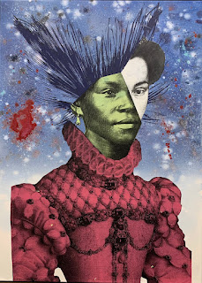 |
| By Raphael Barontini |
Barontini's work is difficult to define. He starts with a classic image from art history, lops off the head (or a portion of the face) and inserts in its place the visage of a person of color. Often the face is that of a Caribbean revolutionary figure, real or imagined. (Barontini's own mixed ethnicity includes some Caribbean blood.) The gallerist said his work is a commentary on post-colonialism, but it seems more complicated than that.
 |
| Barontini in bubble wrap |
PS--In doing my research for this post, I learned that all 15 works in Barontini's first solo show in the US were pre-sold before they graced the walls of the Mariane Ibrahim Gallery last March. Click here to see a review of the exhibit. Perhaps I should have taken the plunge...
Next up: Miami Beach's Art in Public Places program meets Art Basel